20 July 2009

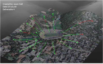
3D view of line of sight analysis


This a 3D view of the orthoimagery and line of sight lines overlaid on a DEM for 3D visualization. I have created line of sight lines within ArcScene but I never knew that you could copy them in ArcMap and paste them into the scene. The only thing I still don't quite understand is when I overlaid the imagery on the DEM the instructions said to offset the base heights by 30. I need to research what this number means and how it affects the display.

Line of sight analysis surrounding Memorial Stadium


This is a line of sight analysis surrounding Memorial Stadium. Also, included below the image is a viewshed based on an observation point from a tower height of around 30ft. I learned that you could create a new field and set your observation points using the OFFSETA field to a certain height.

13 July 2009

Bay area with hydrography and places

A second map showing hydrography and places layers. You can see why DHS requires these layers for threat analysis. With the population in the bay area along with the majority of schools, churchs, businesses, parks, marinas, etc... these layers would be required to know their location if a threat hit and resources were needed.

Department of Homeland Security(DHS) Bay Area Urban Area

This is an overview map of the Bay area showing counties, and places with a 10 mile buffer for analysis purposes.

08 July 2009

Houston crime in vicinity to police stations

This map shows a buffered distance around police stations of 2, 4, and 6 miles. It also shows how much crime is associated within police station zones. Lastly, there are recommended areas for new police substations.

Crime in Houston, Texas

This is a basemap of the Houston area showing crimes. This map was easy to create but the roads layer took forever to draw. Also, I struggled with the chart layout. I had problems getting the chart title to show in the center, and the legend is hard to adjust.

22 June 2009

Housing Suitability - Final

Here is my final result of proposed locations to buy a house in proximity to a hospital and a college. I listed the pros and cons of each overlay and gave my reccomendation of overlay 1 as the best possible location.

Factors in Housing Site Selction

Here is my analysis of the various factors in performing a housing site slection. The only part of these maps that gave me trouble was getting the census data to perform the analysis on median housing values for Maricopa County, Arizona. Downloading the data from the census bureau was tough if you weren't sure exactly what data you wanted. Also, when I downloaded the first time I didn't get all of my fields populated.

17 June 2009

Student Occupancy Rate


Here is a map showing the Pewter City University Student Occupancy Rate. I enjoyed creating this map beacuse of the multitude of datasets involved to perform this analysis.

Environmental Impact Assessment


Here is traffic impact from an Environmental Impact Analysis. This was the first time I had used the chart symbology on a map. Very useful effect.

10 June 2009

Streets affected by 1993 Flood

This map shows the streets affected by the 1993 Flood of the Maplewood Sudivision. As you can see many streets were most likely shut down during this flood event and probably hurt many businesses and customer traffic until flood waters receded.

Building Values Affected by 1993 Flood

This map shows the building values affected by the 1993 Maplewood Subdivision Flood. I tried to show the values in a graph but the range was so large that it wouldn't show much. Displaying in ranges by changing the symbology worked much better.

03 June 2009

Basemap of the Mississippi Coast

This basemap of the region took me awhile to create becuase of all the hydrography features. I wish the creator of the hydrography dataset had combined more of the types together such as canal/stream/river, etc... Seemed like it was broken up too much and symbolizing was a challenge. The elevation dataset was interesting to view; seeing just how low the region is. I don't think I would want to live that close to the coast with the constant threat of flooding.

Mississippi Coastal Flooding after Huricane Katrina


Here is my map showing the coastal flooding areas after Hurricane Katrina. This was a fun map to make, mainly for the reason that I wished I had the opportunity to help make maps during this event. Now I had the opportunity to play with the data and perform some analysis and see it for myself. I think the only struggles I had was understanding the land classification. I wish they had explained exactly what was meant by Barren land. I assumed this land to be the sand dunes along the coast. And I was suprised by the total of developed land. I thought that this total would have been much higher considering the development along the coast. But overall, I learned a lot by the creation of this map and incorporating the chart.